
You are using an out of date browser. It may not display this or other websites correctly.
You should upgrade or use an alternative browser.
You should upgrade or use an alternative browser.
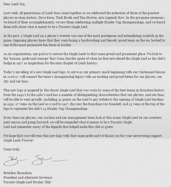
Leafs to unveil new logo & uniforms for 2017.
- Thread starter Montana
- Start date
MindzEye
Wayward Ditch Pig


BKerr
Banned
https://ca.sports.yahoo.com/blogs/n...-leafs--new-logo-to-get-behind-040021040.html
Some people are already making the new logo into the butt of their jokes.
Some people are already making the new logo into the butt of their jokes.
hockeylover
Well-known member
It's pretty beautiful.
Metalleaf
New member
Weak...
These people probably think the team should be called the Leaves.
Hoss
Well-known member
So this means We will never see the ballard leaf again? When they were showing the leaf players in the room watching it, you see that it's everywhere. So you're telling me that the ballard leaf will never be used as a leaf logo from now on?
nice, but I am sure some shirts and posters will still use it, right?
nice, but I am sure some shirts and posters will still use it, right?
LeafGm
Well-known member
I'm sure we'll see the "Ballard Leaf" again in some official capacity. Perhaps as a "third jersey" somewhere down the line. Even if it's not the most aesthetically pleasing of all the various versions of the Maple Leaf this franchise has had, and even if that logo's history includes no Stanley Cups and the two of the darkest periods in the team's history (80's & '05-'15), a lot of fans have grown up with that logo. A lot of all-time Leaf greats spent pretty much their entire careers wearing that logo too.So this means We will never see the ballard leaf again? When they were showing the leaf players in the room watching it, you see that it's everywhere. So you're telling me that the ballard leaf will never be used as a leaf logo from now on?
nice, but I am sure some shirts and posters will still use it, right?
As for whether merch with that logo will still be available to buy---St-Pats gear, and jerseys and apparel with Leaf crests from the 20's, 30's, 40-60's & 1967 have been readily available to anyone who wants to buy them over the last 20 years or so especially. I doubt that's going to change.
Well, they're never going to make one of those...
You missed the important word..."now"...as in I want to drop money to own a jersey today with new logo.
number17
Mod Squad
I like the new logo, though I'm not that surprised by how it looks (and it IS the leaked logo) ... I think all in all, for a storied organization like the Leafs, you can't (and shouldn't) change too much with the logo. Going back to the classic design is the right way to go.
I do wanna know how the new jerseys look like ... and I'm definitely getting one if an official 91 jerseys becomes available")
I do wanna know how the new jerseys look like ... and I'm definitely getting one if an official 91 jerseys becomes available
angelfish
Well-known member
Challenges the BlackHawks for best logo.
That team with the toilet seat logo sucks.
It's nice, but not that NICE
LeafOfFaith
Well-known member
"New" logo. It's like they changed a straight line to a curvy line and pumped this up like the unveiling of a new Mona Lisa.
Big deal.
Big deal.
WellPlayed
Well-known member
You can just say that you hate change. Kulemin's not coming back, man.
LeafOfFaith
Well-known member
My whole point is that it's barely changed.
leafman101
Well-known member
As it should have been. Going back to the original logo, and getting rid of the Ballard logo was exactly what they should have done.
They should have done this decades ago.
They should have done this decades ago.
Preston_Mizzi
Banned
LOF is unbearable. Jesus mother ****ing christ.
LeafGm
Well-known member
Why would we want them to do anything more than "barely change" the logo anyway? The crest we wore from the 40's to the late 60's was perfection. All they needed to do was go back to that logo, with minor tweaks at the most, which is exactly what they've done.
And sure, there is a bit of a cheese factor to having a TV special and videos with dramatic music to unveil a hockey team's new logo. But in the hockey world, it is kind of a big deal when one of the NHL's two remaining ~100 year-old original franchises changes their logo for the first time in almost 50 years.
And sure, there is a bit of a cheese factor to having a TV special and videos with dramatic music to unveil a hockey team's new logo. But in the hockey world, it is kind of a big deal when one of the NHL's two remaining ~100 year-old original franchises changes their logo for the first time in almost 50 years.
LeafOfFaith
Well-known member
I didn't say I wanted them to revamp it.
They turned it into this huge production, with several days of lead-up hype, and then presented something that is almost identical to the crests of years past.
I mean, just draw up a press release with Shanny's letter and send it out when it's ready. The presentation that went into this thing was pretty silly.
Preston_Mizzi
Banned
Yeah, I hate when people turn things into fun little entertainment. Entertainment ****ING SUCKS!!!
Historic team changes logo for first time in 50 years --> don't make a big deal of out it.
??????????????????????????????????????????????????
Historic team changes logo for first time in 50 years --> don't make a big deal of out it.
??????????????????????????????????????????????????