Do you trust any of them? Because ...Who books the acts for these games anyway? The TV network, the NHL, or the host organization?
You are using an out of date browser. It may not display this or other websites correctly.
You should upgrade or use an alternative browser.
You should upgrade or use an alternative browser.
More Stadium Series Tix Released-General Stadium Thread
- Thread starter andyt
- Start date
NoMich
Well-known member
If you haven't seen them live, that band kicks serious backside.
This will be my first show of theirs
That band literally looks like they just rolled up at a Waffle House at 4am after a LONG night, but they're tighter than I don't know what all. EnjoyThis will be my first show of theirs
NoMich
Well-known member
Can't wait. I surprised the old lady with the tickets today. Too bad that run of American Aquarium shows at the Lincoln are already sold out. I really wanted to go last year when the Old 97s were playing with them, but I was still in the midst of rather severe post-Covid brain fog and couldn't do a damn thing
Yeah, I wanted to go that first night with Lucero and Katie Pruitt but I've got a family thing that weekend so ... such is life.Can't wait. I surprised the old lady with the tickets today. Too bad that run of American Aquarium shows at the Lincoln are already sold out. I really wanted to go last year when the Old 97s were playing with them, but I was still in the midst of rather severe post-Covid brain fog and couldn't do a damn thing
CanadaCanes
Well-known member
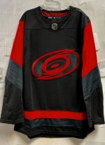
Sounds like the jersey leak from a year or so ago was essentially the same end result for the Stadium Series jersey the Canes will wear. Icethetics had an updated post today on this being the final end product. No word on the Craps yet.
Attachments
It’s worse than meh. It’s lazy.it's meh. I hope it grows on me. The letters an numbers will determine if it's worth buying.
Apparently those are the current font in plain red lettering on black with no accent. So ... unreadable from more than 10 feet. In summary, lazy and 100% mid at the very best. No nod to the old Canes fonts, no nod to State's font (also an Adidas uniform design), just regular old red on black. Whoo freaking hoo. Hot pass. My jersey purchase, if I decide to make one this year, will be the reverse retro.it's meh. I hope it grows on me. The letters an numbers will determine if it's worth buying.
CanadaCanes
Well-known member
I agree, the reverse retro reds from this year are 10 times better than this hot mess, this years reverse retro has grown on me the more I see it. Lazy is an understatement when most of the reaction from last years leak of the same jersey was pretty negative…but I guess the Canes can just hit play on the overused “it’s not us it’s the NHL that controls these things”.Apparently those are the current font in plain red lettering on black with no accent. So ... unreadable from more than 10 feet. In summary, lazy and 100% mid at the very best. No nod to the old Canes fonts, no nod to State's font (also an Adidas uniform design), just regular old red on black. Whoo freaking hoo. Hot pass. My jersey purchase, if I decide to make one this year, will be the reverse retro.
Last edited:
FWIW, while the league has final approval on uniform designs, the teams ABSOLUTELY have input. So, no ... not buying that one if and when they trot it out.I agree, the reverse retro reds from this year are 10 times better than this hot mess, this years reverse retro has grown on me the more I see it. Lazy is an understatement when most of the reaction from last years leak of the same jersey was pretty negative…but I guess the Canes can just hit play on the overused “it’s not us it’s the NHL that controls these things”.
HeyKurtz
Well-known member
Raleigh Magazine has published a guide to all of the Stadium Series events during the week of the game. It includes a downloadable PDF summarizing everything...

 raleighmag.com

NHL Stadium Series Guide
The NHL Stadium Series is finally upon us. Raleigh is set to take center stage as the world watches the Canes and Capitals hit the ice.
CanadaCanes
Well-known member
Great stuff, thanks for sharing Warren!Raleigh Magazine has published a guide to all of the Stadium Series events during the week of the game. It includes a downloadable PDF summarizing everything...

NHL Stadium Series Guide
The NHL Stadium Series is finally upon us. Raleigh is set to take center stage as the world watches the Canes and Capitals hit the ice.raleighmag.com
CanadaCanes
Well-known member
The NC State v. UNC hockey game at Carter Finley that the guide shows with “fingers crossed” is official.
As luck would have it, that happens to be a day off from work for many of us for President’s Day so a nice daytime activity to take part in!


