Nah. I think we're actually due for a re-brand. Everything since Dundon showed up has been very ad hoc and disjointed. It's time to pick a look and stick with it. Sadly for him, since he seems to want something fresh, the only decent option I've seen is the original. For all its flaws, they still can't touch that original logo. It's distinctive, the color pops and it scales up and down in size really well.Jersey/merch sales must be missing targets.
You are using an out of date browser. It may not display this or other websites correctly.
You should upgrade or use an alternative browser.
You should upgrade or use an alternative browser.
2023-24 Canes Misc Thread
- Thread starter jeffbear
- Start date
Can a brother get a link to this new concept art?
View: https://x.com/kagey99/status/1768677134057324825?s=46&t=8056gLL6Pl3wbApF5otK6g
To echo your earlier point, all of the script logos look like something the Mudcats would wear.Middle left .... that's the one that made my teeth hurt. Although the top right sucks too.
They all suck.
Yup. They're all perfectly fine as the text mark, which basically never shows up on a jersey, or some sort of third logo ... but they scream minor league baseball. And I'm concerned that marketing people wouldn't see that. Especially in a minor league market that has seen a team basically wear that same script logo on a jersey in recent memory. You people are aware that the Mudcats still exist. Right? Right?????To echo your earlier point, all of the script logos look like something the Mudcats would wear.
They all suck.
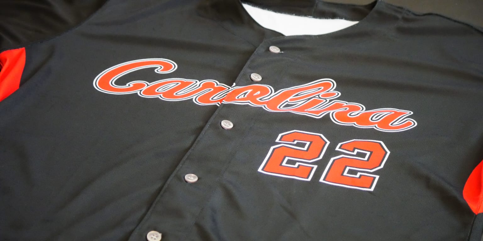
I present the Mudcats Friday night “blackout” jersey from 2022.Yup. They're all perfectly fine as the text mark, which basically never shows up on a jersey, or some sort of third logo ... but they scream minor league baseball. And I'm concerned that marketing people wouldn't see that. Especially in a minor league market that has seen a team basically wear that same script logo on a jersey in recent memory. You people are aware that the Mudcats still exist. Right? Right?????

Mudcats introduce new Friday night game jerseys
The Carolina Mudcats will black out the field with new alternate black game jerseys, and light up the night sky with post-game fireworks every Friday night this season. The new “blackout” game jerseys are black in color with red numbers, “Carolina” scripted in red across the chest, and the...
 www.milb.com
IMO, he was the guy that was hurt the most by not having an AHL affiliate. He had a decent season in Chicago last year but this year has been a bust, no goals in 30 games with Springfield and none in 7 games with Charlotte.Rees to Ottawa for a 6th
Probably, yeah. I think the Canes just lost faith that the offense would translate ... and then he had a crap half a season in Springfield, which obviously didn't help.IMO, he was the guy that was hurt the most by not having an AHL affiliate. He had a decent season in Chicago last year but this year has been a bust, no goals in 30 games with Springfield and none in 7 games with Charlotte.
Yeah ... we've never seen the traditional logo on a black shirt and I think that could be the way to go for the home No. 1. But, again, I think the owner wants a fresh start so I doubt that's where we end up. They seem to be pushing a single letter concept at home with script on the road, and what a team starts off pushing is normally where they end up.I like the black jerseys much more than the red ones but unless they come up with better branding than the eye, the should just have that logo on black background.
NoMich
Well-known member
I hope you STM's that got to take the survey did a loud thumbs down to all. They are hideous.Of them all, I prefer top right, but that's like saying I prefer the stomach flu compared to covid
From what I've seen online, pretty much nobody likes any of that stuff.I hope you STM's that got to take the survey did a loud thumbs down to all. They are hideous.
Harsh, but fair.I hated them all and marked the survey accordingly.
cmaleski2
Well-known member
Elliott Friedman commented over the weekend that Brindy contract discussions are where they were 3 years ago, with Brindy wanting his assistants taken care of first.
Didn't sound like anything ominous but it is still annoying to me that we play out RBA's contracts this way. We are fortunate that RBA doesn't prioritize HIS pay in these contract discussions because a team like Toronto would offer him a lot of money to be their head coach if he was willing to entertain it.
Didn't sound like anything ominous but it is still annoying to me that we play out RBA's contracts this way. We are fortunate that RBA doesn't prioritize HIS pay in these contract discussions because a team like Toronto would offer him a lot of money to be their head coach if he was willing to entertain it.
Last edited:

